
DATSU
Brand Identity
DATSU
Brand Identity
DATSU
Brand Identity
DATSU
Brand Identity
The game of darts is a discipline requiring absolute focus, a steady hand, and perfect accuracy. We approached the visual identity project for the DATSU brand – a manufacturer of high-quality dart sets – with the exact same mindset.
The brand needed modern branding that would successfully appeal to both amateurs playing for fun and demanding professionals.

The game of darts is a discipline requiring absolute focus, a steady hand, and perfect accuracy. We approached the visual identity project for the DATSU brand – a manufacturer of high-quality dart sets – with the exact same mindset.
The brand needed modern branding that would successfully appeal to both amateurs playing for fun and demanding professionals.
The game of darts is a discipline requiring absolute focus, a steady hand, and perfect accuracy. We approached the visual identity project for the DATSU brand – a manufacturer of high-quality dart sets – with the exact same mindset.
The brand needed modern branding that would successfully appeal to both amateurs playing for fun and demanding professionals.
The game of darts is a discipline requiring absolute focus, a steady hand, and perfect accuracy. We approached the visual identity project for the DATSU brand – a manufacturer of high-quality dart sets – with the exact same mindset.
The brand needed modern branding that would successfully appeal to both amateurs playing for fun and demanding professionals.
Idea
The logomark and typography were tailored to the brand to reflect the soul of darts: its sporty character and precision.
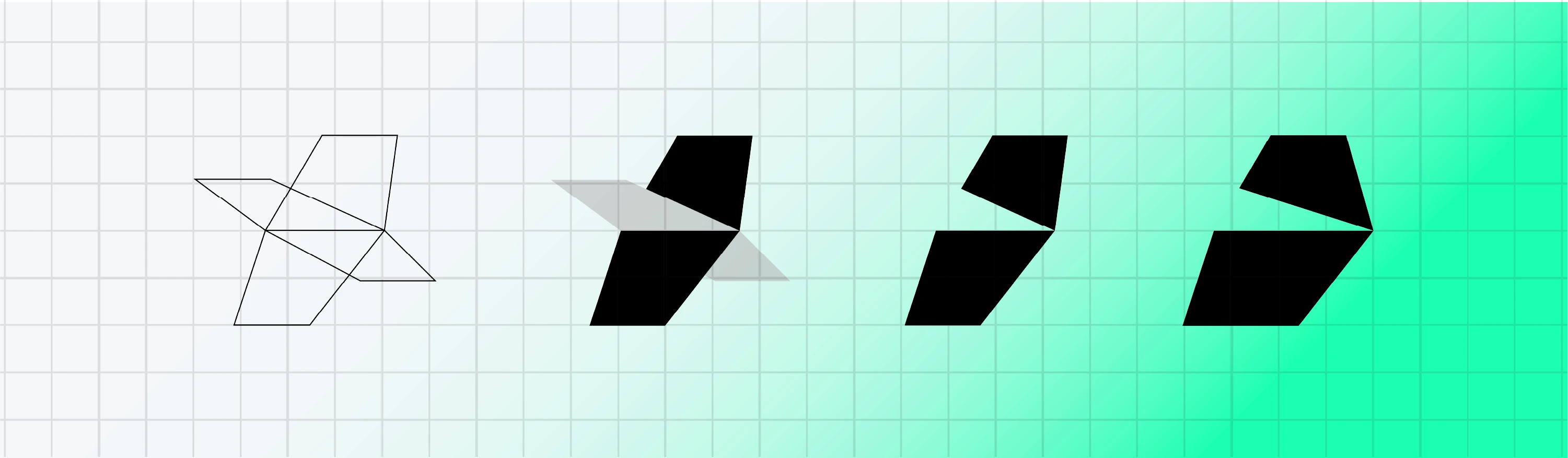
The logomark was created by simplifying a dart flight in a dynamic 3D perspective, applying transparency, identifying the modules that make up the mark, and then simplifying and minimizing its content. Due to UI requirements, the app icon had to be as simple as possible. As a result, we get a dynamic shape that suggests a dart flight and the letter D, referencing the brand's name.

Idea
The logomark and typography were tailored to the brand to reflect the soul of darts: its sporty character and precision.
The logomark was created by simplifying a dart flight in a dynamic 3D perspective, applying transparency, identifying the modules that make up the mark, and then simplifying and minimizing its content. Due to UI requirements, the app icon had to be as simple as possible. As a result, we get a dynamic shape that suggests a dart flight and the letter D, referencing the brand's name.
Idea
The logomark and typography were tailored to the brand to reflect the soul of darts: its sporty character and precision.
The logomark was created by simplifying a dart flight in a dynamic 3D perspective, applying transparency, identifying the modules that make up the mark, and then simplifying and minimizing its content. Due to UI requirements, the app icon had to be as simple as possible. As a result, we get a dynamic shape that suggests a dart flight and the letter D, referencing the brand's name.
Idea
The logomark and typography were tailored to the brand to reflect the soul of darts: its sporty character and precision.
The logomark was created by simplifying a dart flight in a dynamic 3D perspective, applying transparency, identifying the modules that make up the mark, and then simplifying and minimizing its content. Due to UI requirements, the app icon had to be as simple as possible. As a result, we get a dynamic shape that suggests a dart flight and the letter D, referencing the brand's name.

Key Visual
For the visual identity, a texture was created with elements inspired by the construction and flight of a dart. The texture serves as a brand pattern and can be used in various types of animations (loading screens, etc.).
Key Visual
For the visual identity, a texture was created with elements inspired by the construction and flight of a dart. The texture serves as a brand pattern and can be used in various types of animations (loading screens, etc.).
Key Visual
For the visual identity, a texture was created with elements inspired by the construction and flight of a dart. The texture serves as a brand pattern and can be used in various types of animations (loading screens, etc.).
Key Visual
For the visual identity, a texture was created with elements inspired by the construction and flight of a dart. The texture serves as a brand pattern and can be used in various types of animations (loading screens, etc.).



Art direction
Krzysztof Wasilewski
Design
Krzysztof Wasilewski
Art direction
Krzysztof Wasilewski
Design
Krzysztof Wasilewski
Art direction
Krzysztof Wasilewski
Design
Krzysztof Wasilewski
Art direction
Krzysztof Wasilewski
Design
Krzysztof Wasilewski